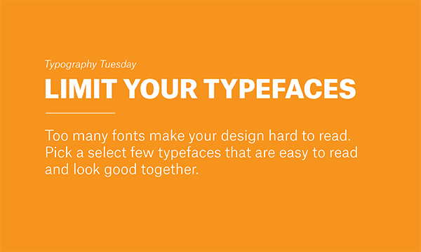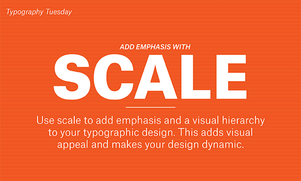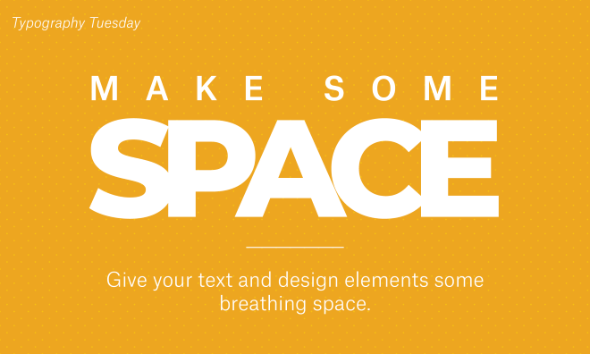
Whether you’re designing a wholesale business card, a flyer, a bookmark, or a poster, pay attention to SPACING in your typography. Spacing is often overlooked for the sake of cramming in a little more information. In our experience, it’s better to cut down on your text so that all elements of your design have sufficient spacing.
Give each object and piece of text enough space to breathe. Your final design should be evenly spaced, without overcrowding of shapes, text, or images. This allows the viewer to more easily absorb the most crucial pieces of information.