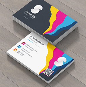
A business card is a true showcase of a designer’s skill. It offers extremely limited space to make a huge impact. Custom business cards must be an effective introductory tool that properly represents the business and its values.
With limited space, designers naturally turn to impactful typography to make a statement. Typography generally refers to the placement of letters; however, typography has increasingly become an art form. Modern typography now refers more broadly to using letters to make a graphic design statement. Words and letters take the place of illustrations. In essence, your text is the design.
As a leading wholesale business cards printer, we’ve seen what works—and what doesn’t—when it comes to effective typographic business cards. As you prepare to design and print your custom business cards, here are some questions to keep you on the right track.
1. Is it legible?

Credit: CREATIVE SHOP
A stunning design loses its power if the text can’t be easily read. Effective typography is a fine balancing act between form and function. Choose and use fonts that are easy to read on your small canvas. Choose colors and layouts that lend to legibility.
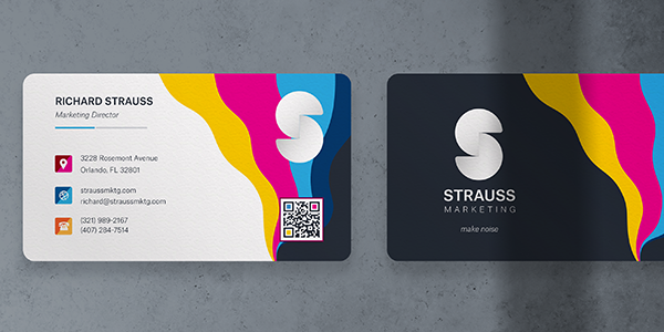
2. Do your fonts complement each other?
Credit: Adam Trageser
Typography is art. And art requires balance. Choose your fonts carefully and make sure that they work well together. A simple rule of thumb is to pair a serif font with a sans-serif font. Serif fonts typically work well for larger text elements, while sans-serif fonts work well for contact information.
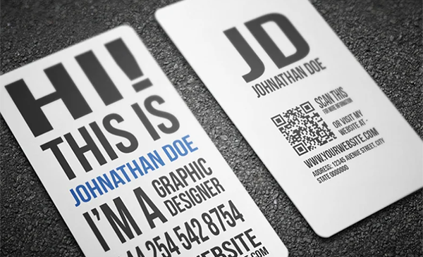
3. Do you have a type hierarchy?
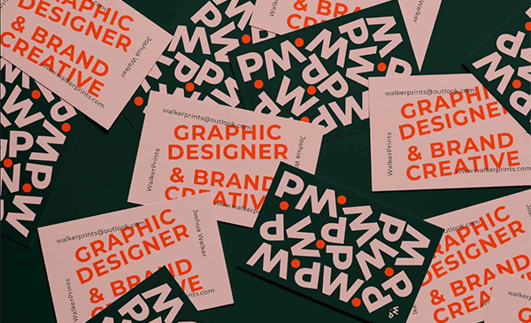
Credit: WALKER PRINTS
This takes some planning. You will use fonts of varying sizes and styles. Create a hierarchy of typefaces so that impactful fonts are used for emphasis and smaller fonts are applied to the text of less importance.
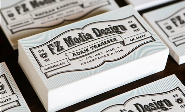
4. Do you have a power font?
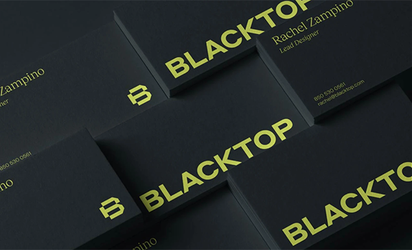
Credit: Jared Granger
You’ll want to emphasize certain text elements on your card. For these elements, you should use your “power font”. These fonts draw the eye and make an impact. While you may use multiple fonts in your hierarchy, you should typically choose one power font if you want it to be as effective as possible.
5. Is your message clear?
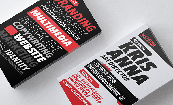
Credit: LEMONGRAPHIC
Finally, step back and see if your message is being stated clearly. Don’t overdo it. Make sure that every element in your typographic design is contributing to the end goal. If an element doesn’t fit, don’t be afraid to drop it. Sometimes less is more. And often, effective business card typography simply means clear, carefully chosen, properly paired fonts.
Make Your Mark!
Now it’s your turn to design and print a typographic custom business card. If you’ve got a great example of effective business card typography, we’d love to see it! Drop an image in the comments on one of our social platforms.
Then head on over and let us take care of printing your snazzy new wholesale business cards.