Artificial intelligence has become a powerful creative partner for designers, marketers, and business owners. Need logo concepts? AI can generate dozens in minutes. Looking for a fresh color palette? A few prompts can produce hundreds of possibilities. The speed and convenience are remarkable.
But there is one important detail that often gets overlooked during the excitement of creating a new brand identity:
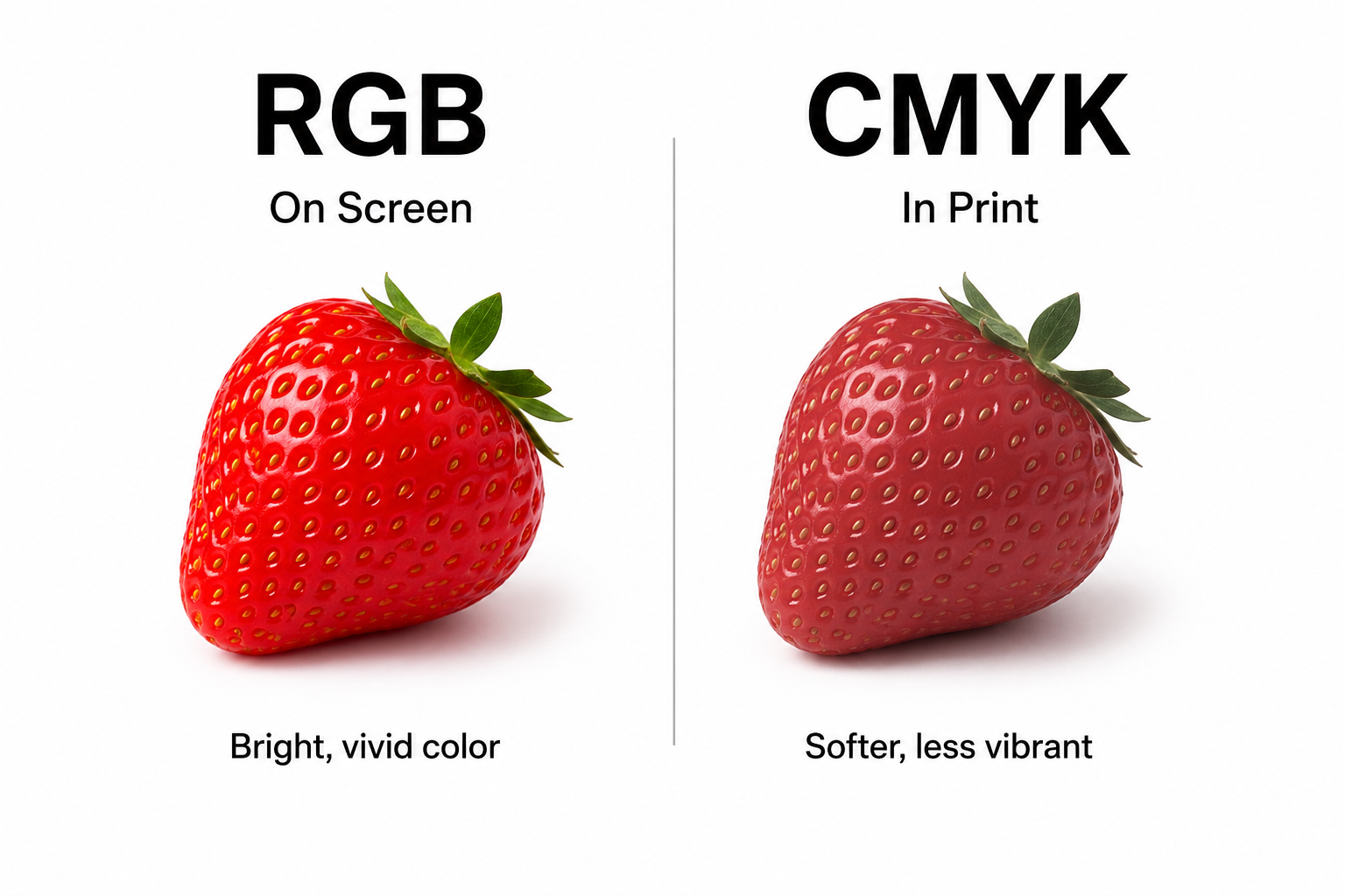
Not every color that shines on a screen can be reproduced accurately in print.
As more businesses rely on AI-generated branding assets, I’m seeing a growing disconnect between digital design and physical production. A color palette may look vibrant on a laptop, tablet, or phone, only to produce disappointing results when printed on packaging, brochures, labels, or signage.
The reason comes down to how color is created.
Digital devices use light to display color. Screens combine red, green, and blue light to produce millions of brilliant shades. This system allows for incredibly vivid colors, especially bright blues, greens, and neon-like tones.
Printing works differently. Instead of emitting light, printed materials reflect light. Commercial printing relies on cyan, magenta, yellow, and black inks to recreate color on paper. Because ink has physical limitations, certain colors simply cannot be reproduced with the same intensity seen on a screen.
This becomes a challenge when brand decisions are made entirely in a digital environment.
Imagine a company investing thousands of dollars into packaging, direct mail, promotional products, trade show displays, and printed marketing materials. If the approved brand colors exist outside the printable color range, every vendor is forced to make adjustments. The result can be inconsistent colors across different products and suppliers, weakening the visual identity the brand worked so hard to establish.
The issue is especially common with startup brands and businesses undergoing rebranding. Teams often fall in love with colors based on digital mockups without considering how those colors will behave in the real world. By the time printing begins, difficult conversations have to happen about color shifts, compromises, and expectations.
Fortunately, this problem is preventable.
The best time to evaluate color performance is early in the design process. Before finalizing a logo, packaging system, or brand guide, designers should test how colors convert to print production standards. Small adjustments made upfront can preserve the overall look and feel of a brand while ensuring consistent reproduction across every marketing channel.
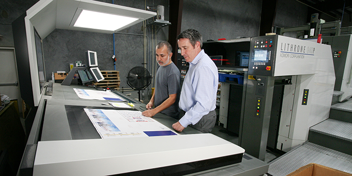
Physical proofs also remain one of the most valuable tools in the production process. No monitor, no matter how expensive or well-calibrated, can perfectly predict how ink will interact with paper, coatings, textures, and lighting conditions. Reviewing a printed proof provides clarity that digital previews simply cannot match.
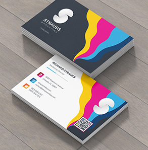
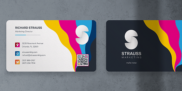
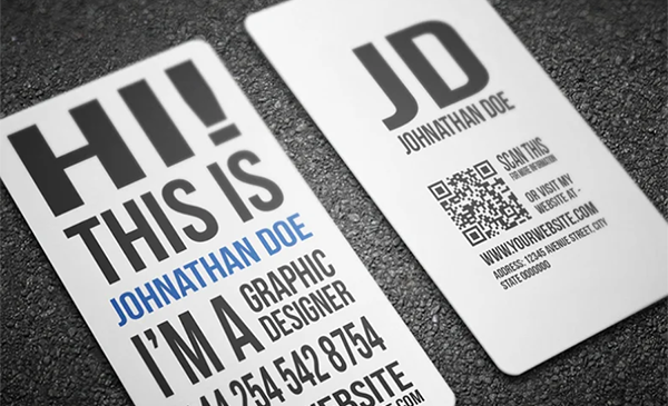
A strong brand isn't defined by how it appears on a single screen. It is defined by consistency. Customers should recognize the same visual identity whether they encounter it on a website, a product package, a business card, a catalog, or a storefront sign.
AI can help spark creative ideas, but production expertise still matters. The most successful branding projects bridge the gap between digital creativity and real-world execution, ensuring that the colors chosen during the design phase remain effective wherever the brand appears.
When developing your next brand identity, don't just ask how the colors look on screen. Ask how they'll perform everywhere your customers will see them. That's where truly effective branding begins.